Hannah Feehan
cv →
← all work
case study 01 · 2026

A debt tracker designed to reduce shame, because shame is why people stop opening the app.

role
Product design, research, frontend
tools
Figma, React, TypeScript, Supabase
duration
6 weeks
sector
Personal finance
A grid of angled Mirian screens: the dashboard leading on a debt-free date, the debts list, adding a debt, logging a payment, the year tracker, a single debt's detail page and settings.
01 · problem

Debt tools are built for people who feel fine about their debt.

97% of neurodivergent people say their neurodivergence makes debt harder to manage, but 64% never ask their creditors for help, and only 32% of those who reach debt advice disclose being neurodivergent at all (StepChange/Equifax, 2025). The gap isn't awareness. It's shame: overwhelm, anxiety and stigma are the top reasons people go quiet exactly when they need support most.

Red totals, streaks and scolding notifications punish exactly the moment a user most needs to engage, and neurodivergent users, who are over-represented in problem debt, drop out first. For users with a PDA profile, it goes further: PDA is an anxiety-driven need to stay in control, where demands themselves, not just the task behind them, trigger avoidance. A notification pushing "pay now" doesn't create urgency, it creates a reason to look away.

02 · research

What the interface itself was doing to people, not just what it was tracking.

Most trackers offer only paid or not paid. For a user managing debt with ADHD, that binary is actively hostile: a part payment, made on a month when full payment wasn't possible, reads as failure and either goes unlogged or gets recorded as a loss. Research on ADHD motivation shows goals become more achievable with visible context and reachable wins, which reframed the problem: the interface was the thing triggering avoidance, not the balance itself.

avoidant

Knows the balance exists and actively avoids checking it, because seeing the number feels worse than not knowing. Needs the app to lead with something other than the total.

over-monitoring

Checks compulsively, re-entering the same numbers for reassurance, which increases anxiety rather than resolving it. Needs a single, trustworthy source of truth rather than a running mental tally.

newly diagnosed

Recently identified as neurodivergent and only just connecting that diagnosis to years of financial struggle. Needs the app's tone to explain, not judge, since it may be the first tool that has acknowledged the connection at all.

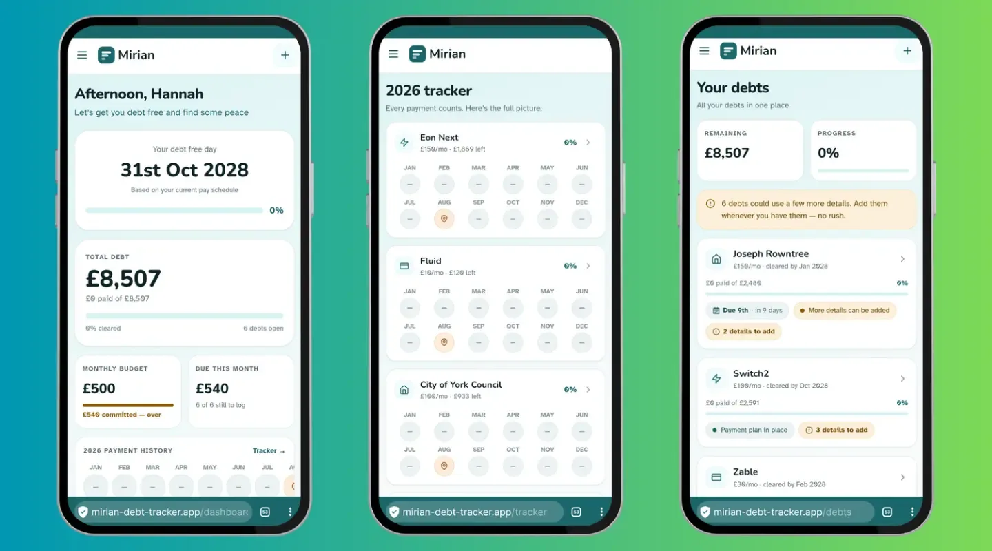
Three Mirian screens on mobile. The dashboard leads with a debt-free date rather than a balance, then the total, the monthly budget and what is due this month. The 2026 tracker gives each debt a twelve-month row of payment markers. The debts list shows what is remaining and, on each debt, a plain prompt that more details can be added whenever, with no deadline attached.
Dashboard, tracker and debts
03 · decisions

Every decision answers a specific ND mechanism, not a general accessibility checklist.

  1. 01

    Paid/unpaid became on time, late, short, overpaid. A binary only works if life is binary. This state alone addresses the avoidant persona directly: a short payment now has somewhere to go other than "failure", which is what stops it going unlogged.

  2. 02

    Due dates are tracked per debt, not left to memory. Executive function is what fails first under financial stress, so the app was built to carry that specific load rather than assume it will be remembered, which is also what stops the over-monitoring persona re-checking the same information by hand.

  3. 03

    The balance owed stepped aside for a live debt-free-by date. An open balance only measures distance from a goal, which research on ADHD motivation identifies as demotivating precisely because the win never feels reachable. A date that moves closer with each entry gives a visible, incremental reward instead.

  4. 04

    Arrangements got a third state: in place, needs setting up, awaiting response. Most real debt sits unresolved, not settled, and a system that only offers two states forces a false answer, which is its own small, avoidable source of shame.

  5. 05

    No red, no streaks, no total on the home screen unless asked for. Colour and gamification mechanics common to the category read as pressure, and pressure is exactly what a PDA profile responds to with avoidance rather than compliance.

  6. 06

    Plain-language framing over financial jargon, because jargon adds a second barrier on top of an already anxiety-loaded task.

  7. 07

    Every destructive or overdue state is written as a sentence, never signalled by colour alone, both for colourblind accessibility and because a red badge alone reads as an alarm, where a sentence can carry the same information without the same charge.

  8. 08

    Reduced motion respected throughout, since sudden movement is a common sensory trigger and has no functional purpose here.

  9. 09

    A creditor contact email field sits ready in the debt record, so the hardest single action in debt management, actually contacting a creditor, has its detail in place before the moment someone is ready to use it, rather than adding a lookup step on top of an already difficult decision.

04 · handoff

Built solo, in beta.

Built solo rather than handed over, and currently in beta testing. Five payment states with row-level security scoping each user's financial data individually, and the interface set in Atkinson Hyperlegible throughout for legibility. Jade green and peach replace the red-and-alarm palette the category defaults to, with a leaf motif standing in for growth rather than debt.

05 · outcome
4
payment options
5
payment states

In beta testing. Outcome figures follow once that finishes, nothing is claimed here that hasn't happened yet.

Visit the Mirian beta

next

JWD Client Portal