Hannah Feehan
cv →
← all work
case study 02 · 2026

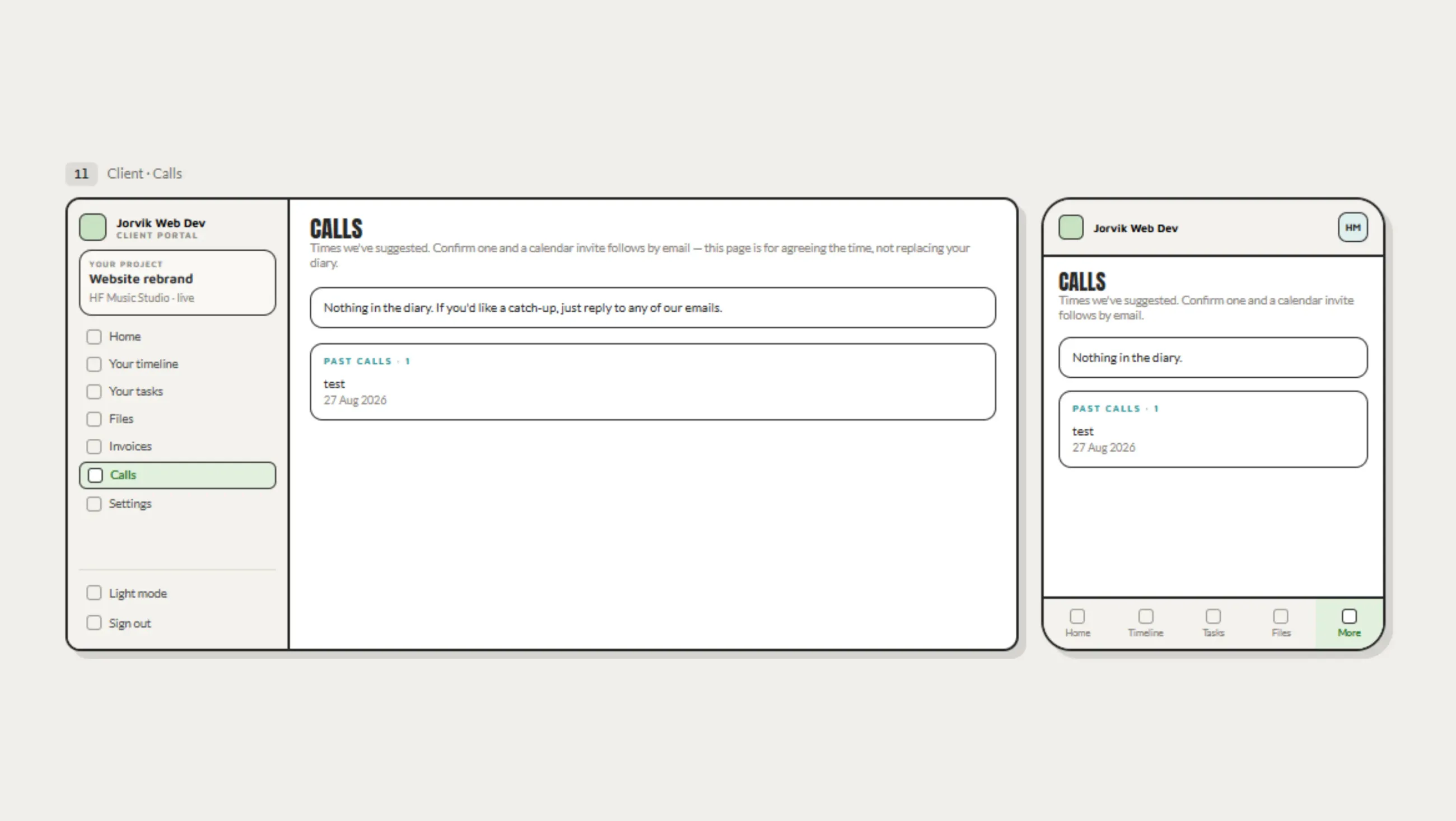
A portal for my own studio, built around one question: what do I need to see, at what point.

role
UX/UI Designer Developer
tools
VS Code, Next.js, TypeScript, React, NextAuth, PostgreSQL, Vercel, Canva
duration
4 weeks
sector
Internal tools
The JWD Client Portal dashboard, showing project status and milestones.
01 · problem

Projects were managed across email, Notion and ClickUp, costing money and needing constant setup.

Running a freelance web dev studio across three separate platforms meant three separate systems to maintain, and for an AuDHD brain, three separate places to lose track of things. Notion and ClickUp both demanded structure be imposed up front, before a project had shown what structure it actually needed. Clients had to learn tools they'd never use again for a single job. Emails got buried in spam, deadlines slipped through the gap between platforms, and projects dragged on for reasons that had nothing to do with the work itself.
02 · research

Lived experience and existing research informed every design and IA decision.

There was no separate research phase, because the research had already happened, just not for this project. Years of lived experience as AuDHD sat alongside existing evidence: adults with ADHD show measurably lower dopamine receptor and transporter levels in the brain regions that drive motivation and reward processing, which is part of why a distant, undifferentiated task list rarely gets opened, let alone finished. The reward system responds far better to something immediate and visible than to a single outcome sitting weeks away, which is what pointed toward stats and progress markers sitting at the top of the interface rather than buried in it.

PDA needed separate handling from that. PDA is an anxiety-driven need to stay in control and avoid other people's demands and expectations, where control is what keeps the anxiety manageable, so anything in the interface that reads as an instruction risks the same shutdown a verbal demand would trigger, however well-intentioned the nudge. That ruled out due-date banners, red badges and progress bars styled as pressure, and pointed toward colour and iconography that inform rather than instruct.

That reframed the brief. The question wasn't "which project management tool fits my workflow", it was "what does an interface have to do to stop me avoiding it". Designing with the AuDHD rather than around it meant building the information architecture around moments of need, rather than around database objects, which is the opposite of how Notion and ClickUp are structured.

03 · decisions

Exactly what needs to be seen, and nothing else.

Every screen decision was tested against the same standard: does this reduce the gap between wanting to check on a project and actually checking. If a piece of information couldn't justify its presence against that standard, it didn't make the screen.

  1. 01

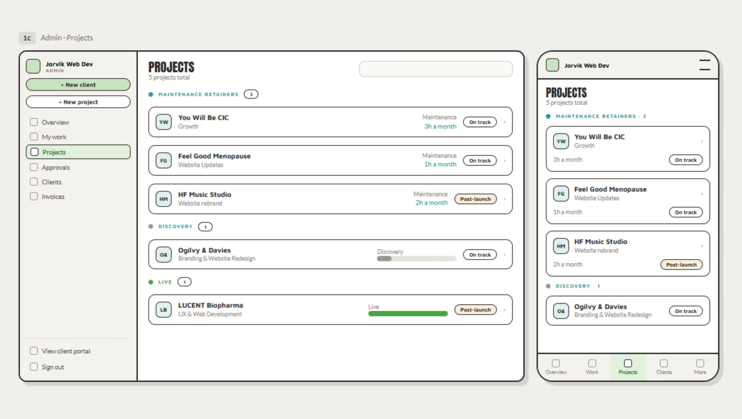
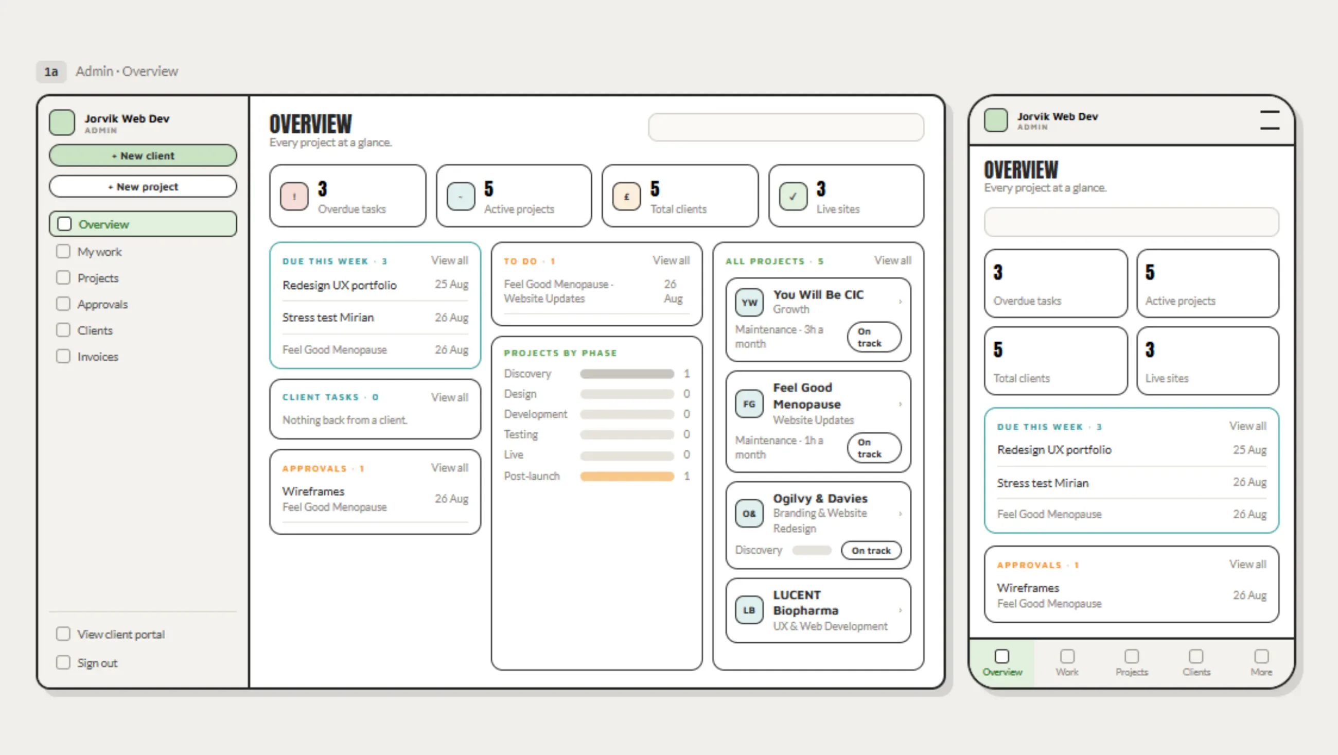
    Stats sit at the top of the dashboard. A visible sense of how much is actually done builds momentum rather than dread, so this was placed first rather than buried under task lists. Colour coding and large icons frame the same numbers without triggering PDA the way a demand-styled progress bar would, and give a quick, low-effort win to look at on a low dopamine day, when opening a wall of text wouldn't happen at all.

  2. 02

    "To do" and "due this week" are separate, not one sorted list. A single long list, however well ordered, doesn't hold attention on its own, it just becomes background noise. Splitting the same data into "everything, in date order" and "only what's due now" means time gets planned around what's actually urgent, not around whatever happens to be at the top of a scroll.

  3. 03

    Views are mixed, not fixed. Kanban, lists and charts sit alongside each other because the same project needs to be read differently depending on the day and the headspace, and forcing one view to do every job would mean fighting the interface on the days it matters least to.

  4. 04

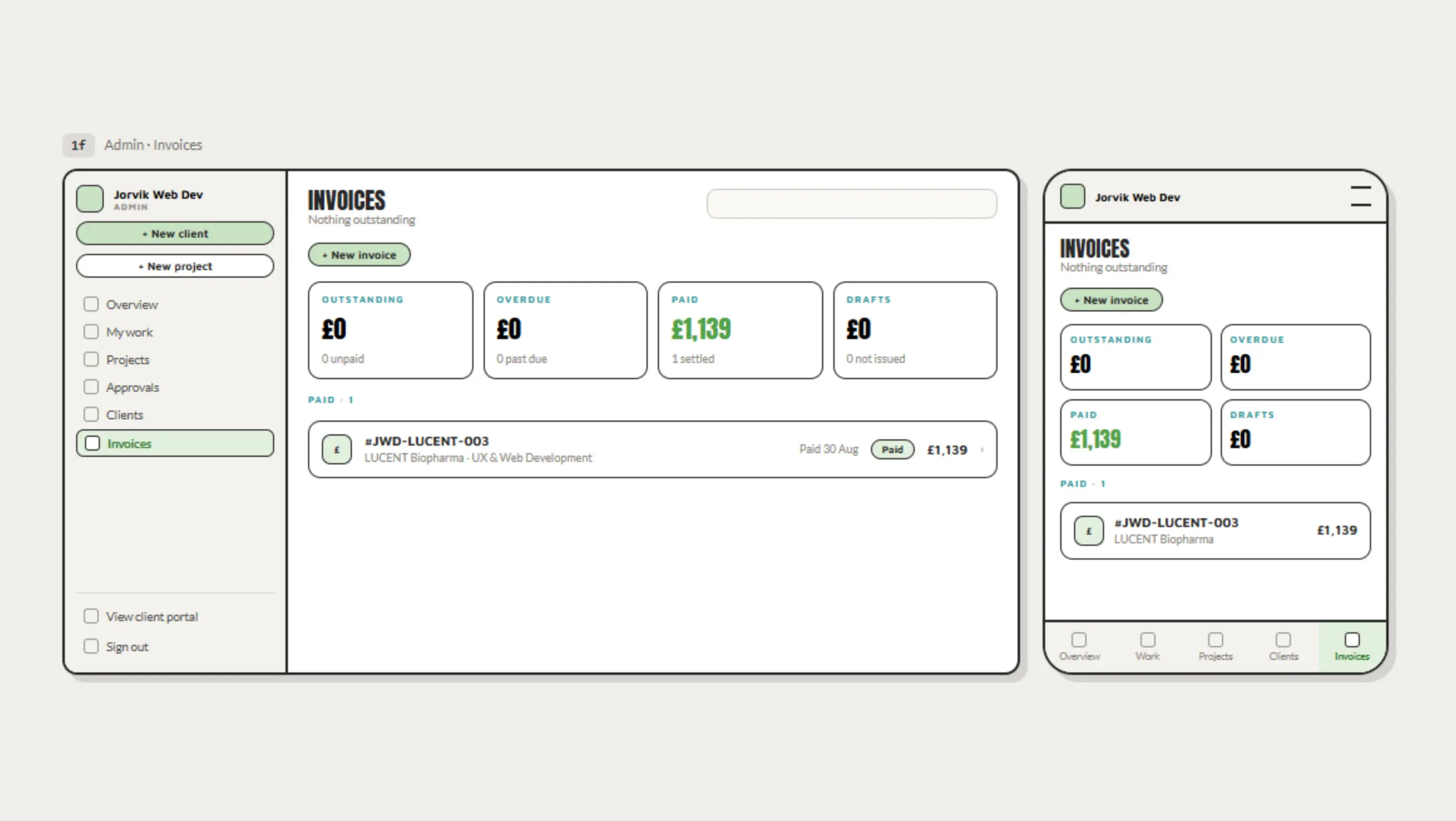
    Invoices generate with JWD branding built in. Removing the step of exporting into a separate invoicing tool removes a context switch that has nothing to do with the actual task of getting paid.

Client portal · database
Schema map

Twenty tables, grouped by what they do. Select any card to see its columns. Hover to light up everything it connects to.

PKprimary keyFKforeign keyrequired

Clients & access

who logs in, and what they can see

Delivery

everything that hangs off a project

Money

invoicing

Admin & meta

internal, not client-facing
auth.users

Supabase Auth owns this table, so it sits outside public. The only way in is portal_users.user_id, which carries the admin-or-client role and, for clients, the one client_id their row-level security rules are built on.

04 · handoff

Built to be handed to a client, not just used by me.

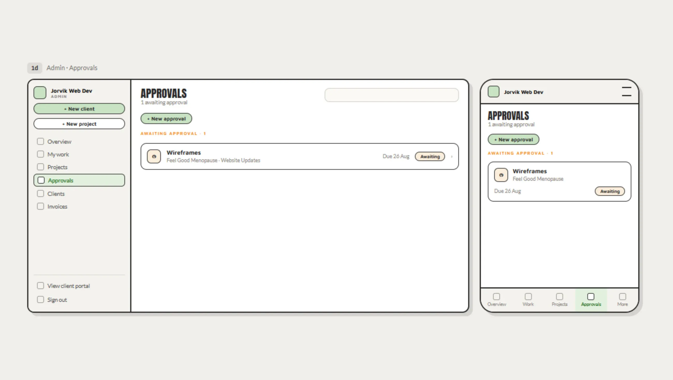
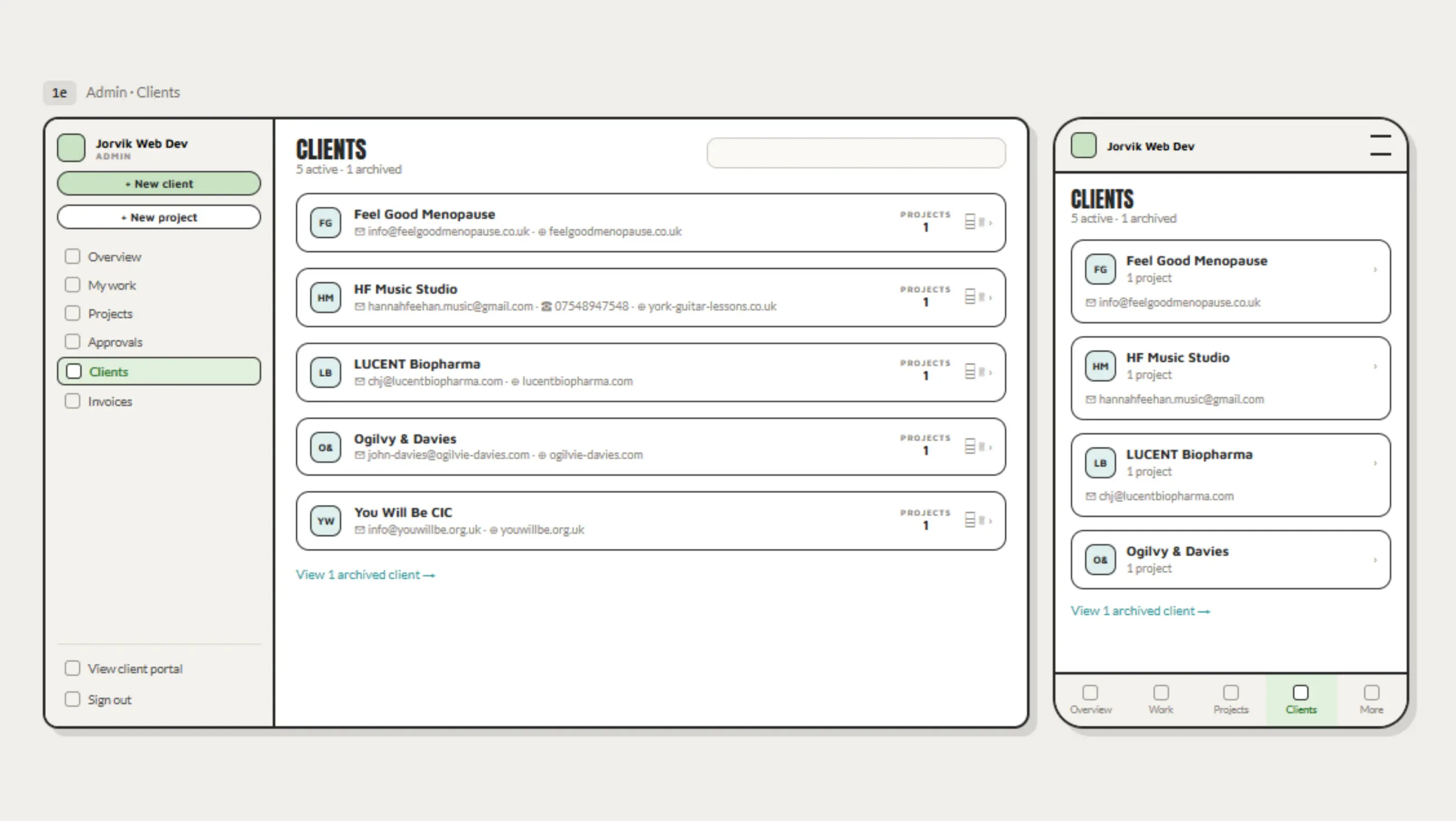
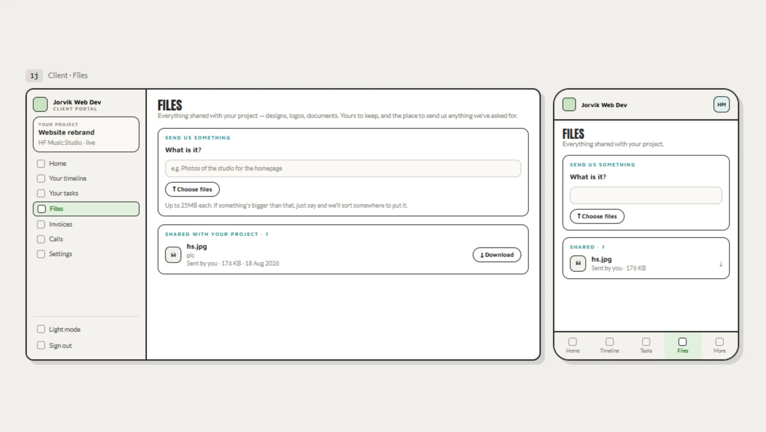
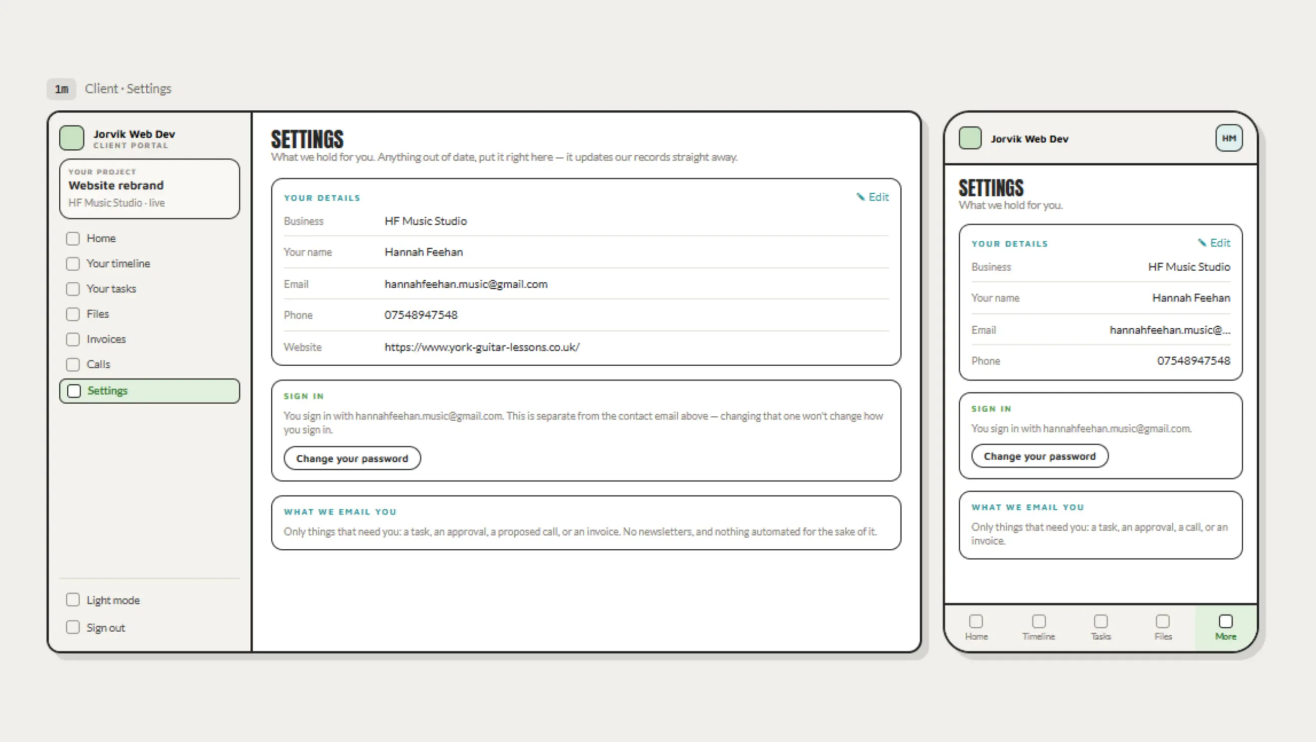
Clients are invited manually, project by project, there's no self-serve signup to get wrong. Access is role-based once in: a client sees their own project in full, but anything not relevant to them is hidden by default rather than exposed and roped off, which keeps the interface calm for them in the same way it's calm for me. When a project ends, its data is archived rather than deleted immediately, and cleared after two years.

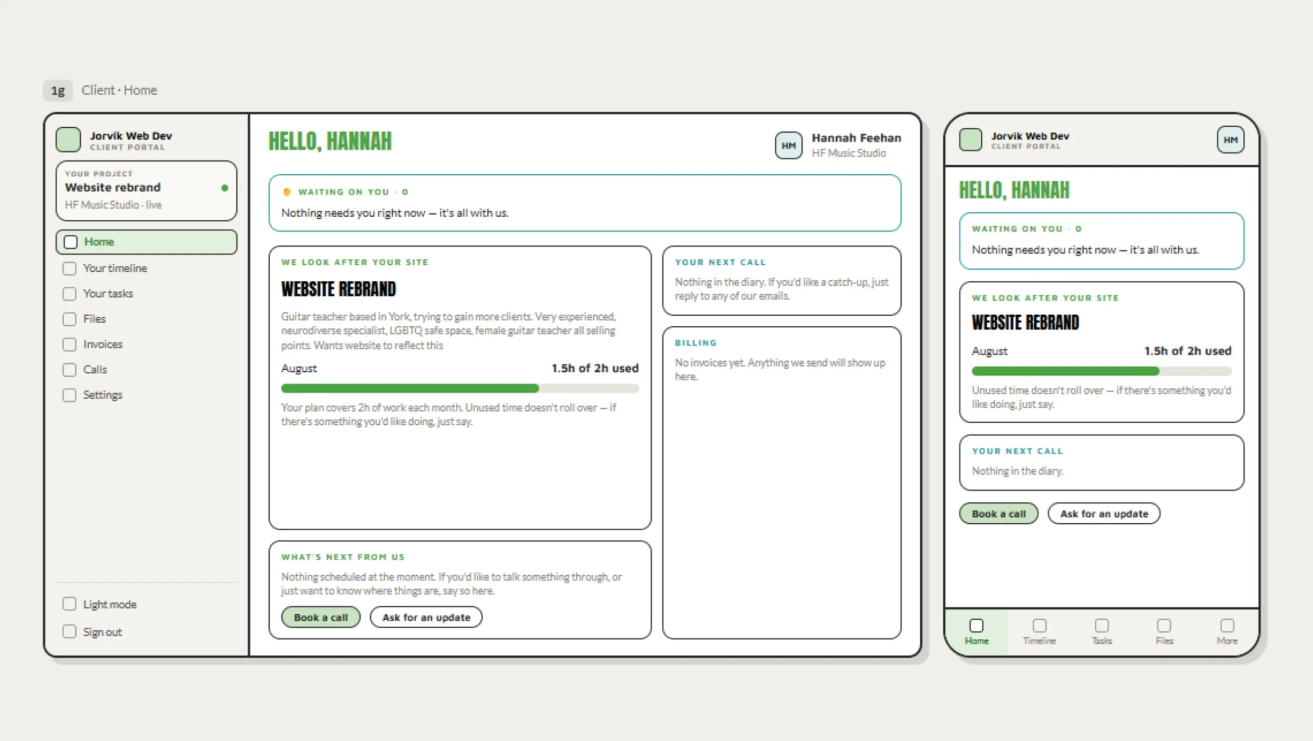
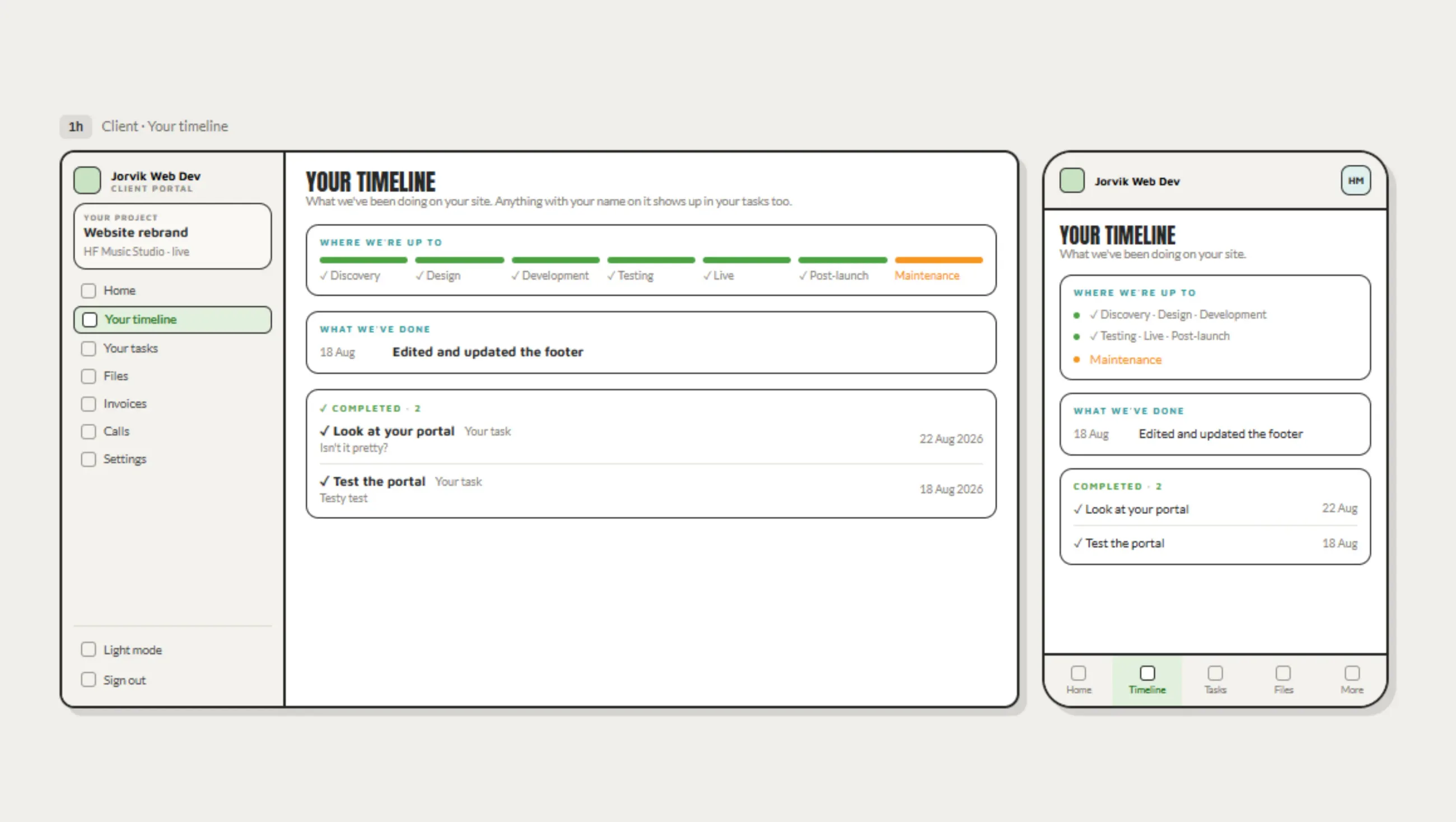
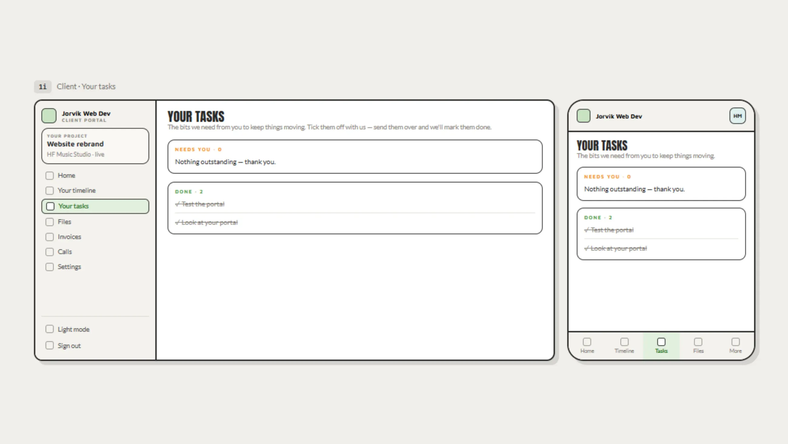
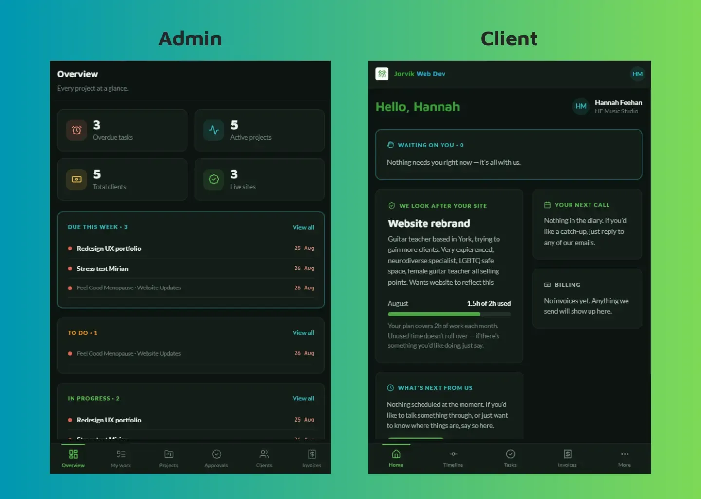
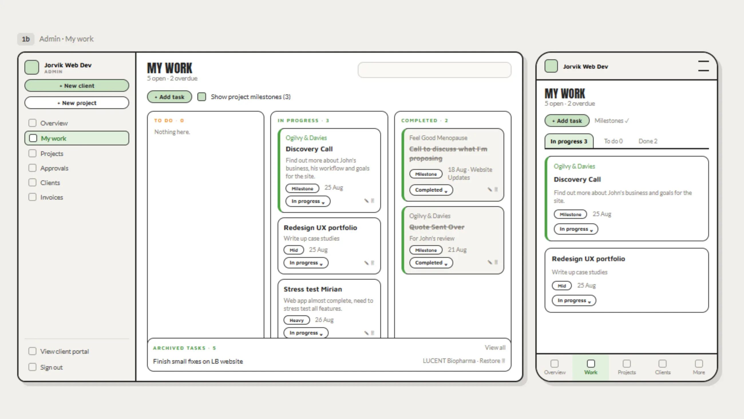
The two built dashboards side by side. On the left the admin overview, with counts for overdue tasks, active projects, clients and live sites above lists of work due this week, to do and in progress. On the right the client home, opening on a waiting on you panel, then the project summary with hours used this month, the next call, and billing. Both carry a bottom navigation bar, and the client wording stays plain throughout.
Admin and client, side by side
05 · outcome

8 live client projects, one system instead of four, and roughly 5 to 10 hours a week back.

8
live projects
4 → 1
tools consolidated
5-10
hours saved weekly (est.)

Communication with clients now lives in one place instead of scattered across email and separate tools, so nobody has to learn anything new to use it. Reminders and project timelines run automatically instead of being tracked by memory, which keeps things on schedule without adding admin. It's in daily use across 8 live client projects, with onboarding now a single guided path instead of a checklist held in my head.

Visit portal.jorvikweb.dev

next

LUCENT Biopharma