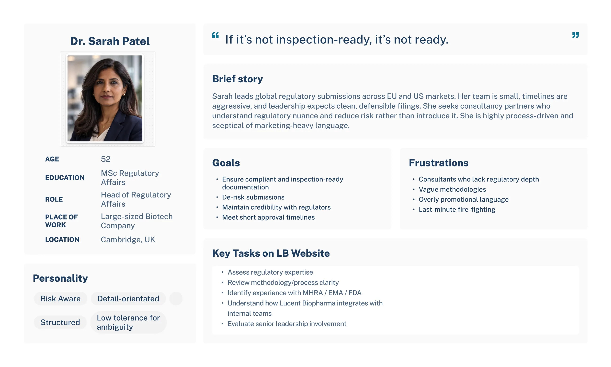
Every build decision traced back to the same research finding: visitors want
their first question answered fast, and each persona's question was different.
That shaped everything from layout to iconography.
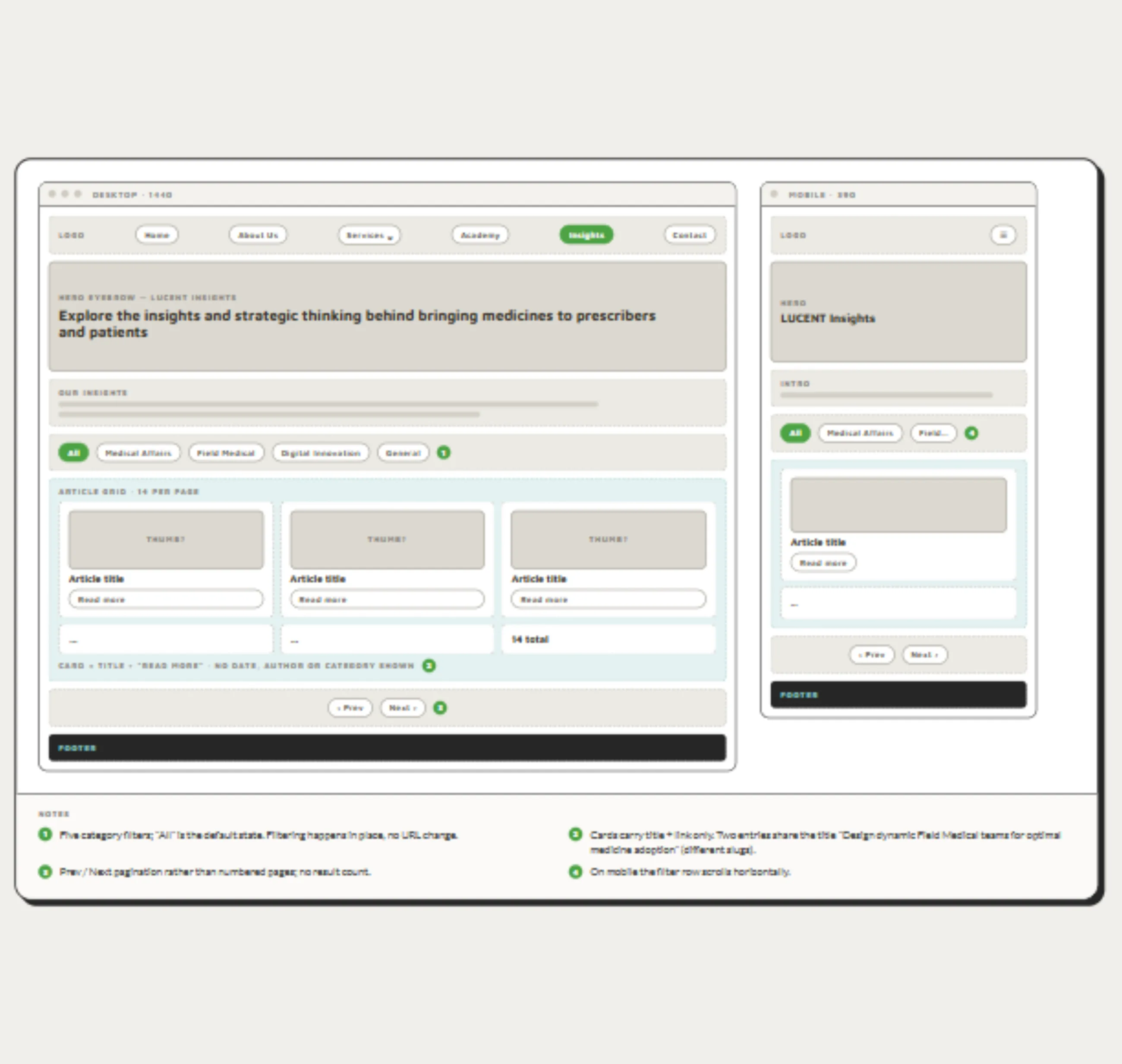
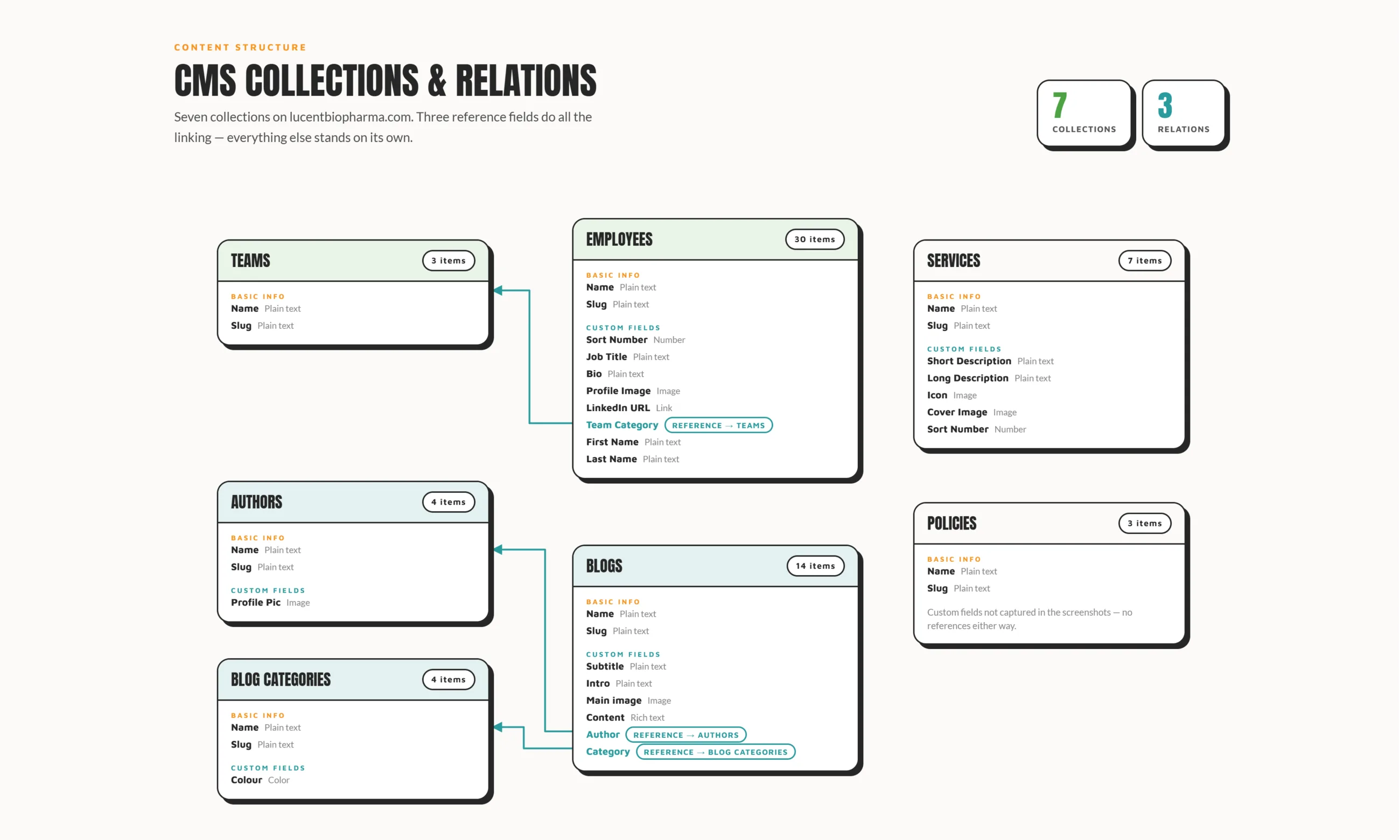
Services, employees and Insights (the blog) were consolidated into Webflow CMS
collections, with a custom filter, tabs and pagination on Insights, so a visitor
finds the right service or article in one step rather than scrolling a long
list. The pipeline became a CMS collection too, carrying stage, indication,
modality and last reviewed date, so the science team updates trial data
themselves instead of raising a ticket for it.
Each service page needed its own hero, since a generic template couldn't hold
what made each service distinct, so those were custom built rather than pulled
from a shared component. That same logic ruled out reusable cards across the
site: content varied enough page to page that forcing it into one component
would have flattened exactly the differences the personas needed to see. Custom
card flip animations, built in JavaScript, HTML and CSS, let services and team
members reveal detail on demand without adding another page to click through.
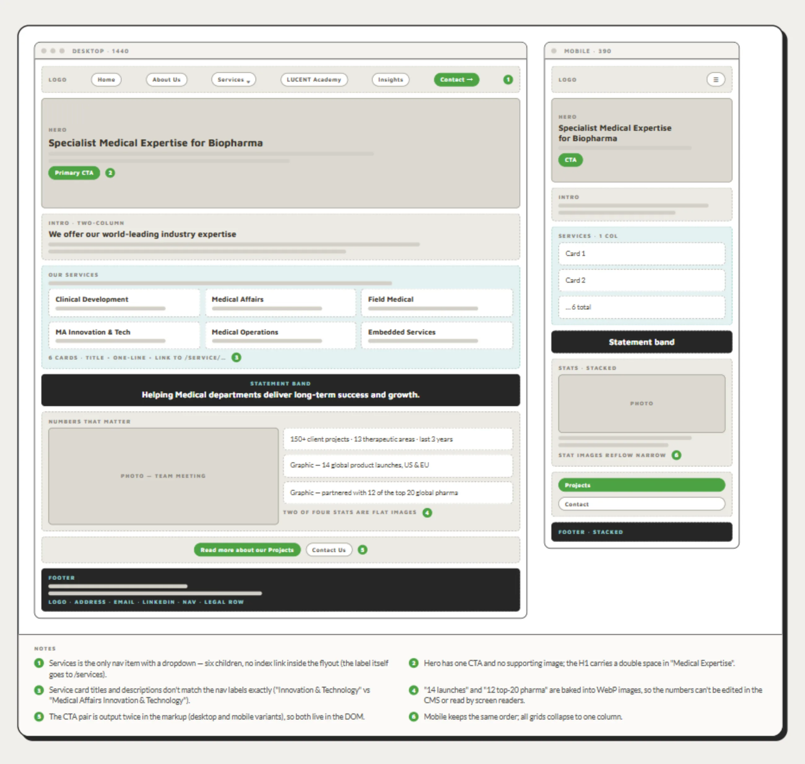
A complex grid layout and multiple custom breakpoints, matched precisely to the
graphic designer's hi-fi wireframes, kept the design coherent from investor-desk
widescreens down to mobile.
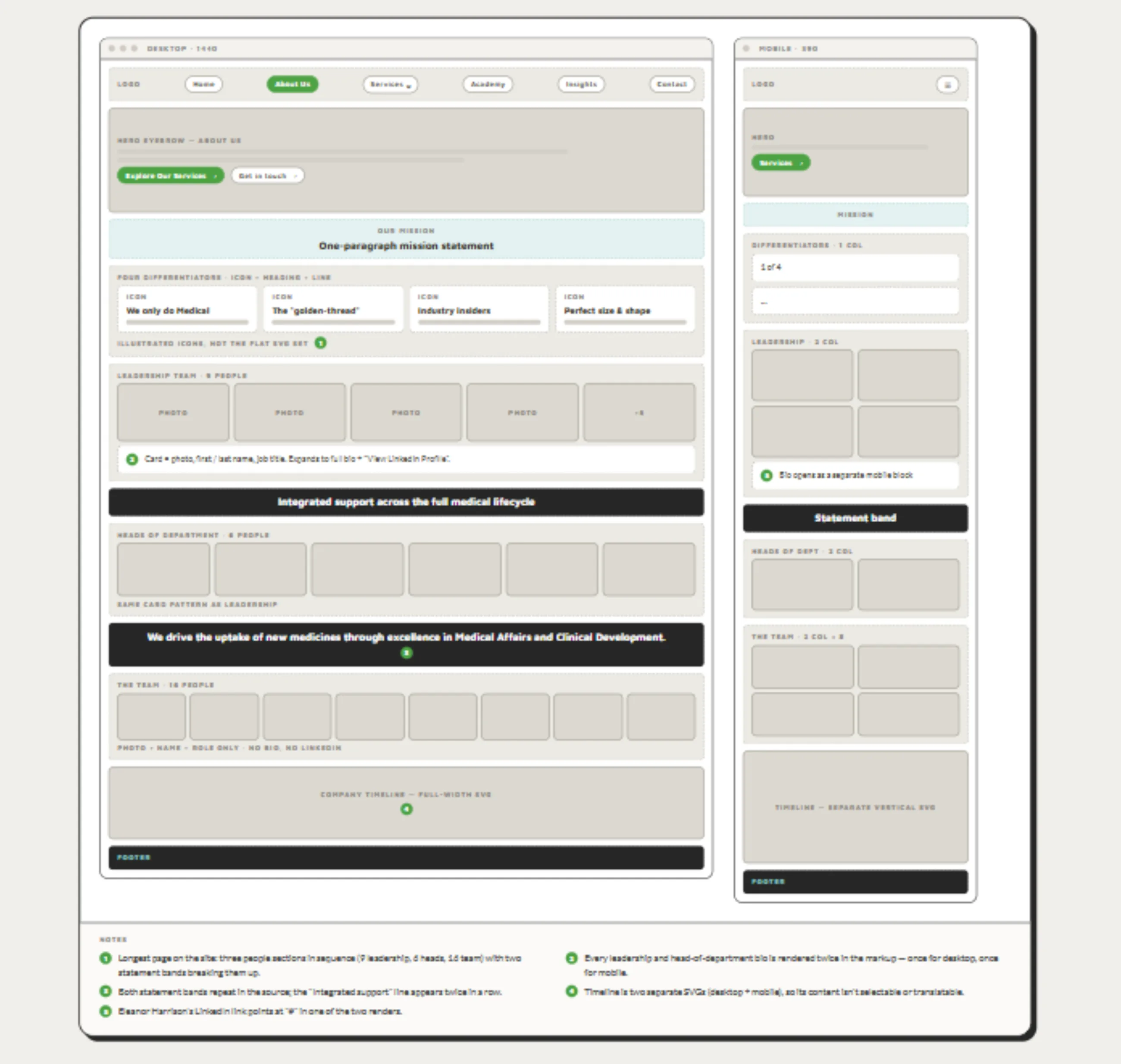
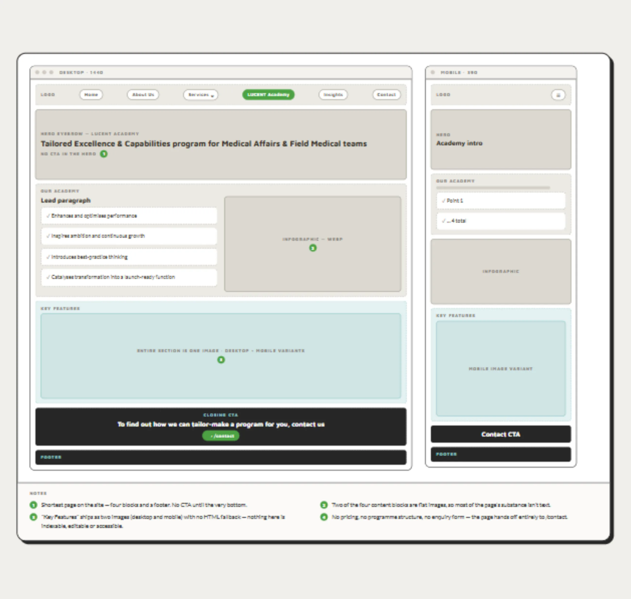
Every page also got a fully separate mobile design rather than a scaled-down
desktop layout, so the experience holds up regardless of screen size, in line
with the research finding that a broken or awkward mobile view undermines the
credibility a biopharma site depends on.
On the About Us page, a custom-coded accordion handles the team section on
mobile, keeping a large team browsable without overwhelming a small screen.
Iconography was designed to carry meaning at a glance, cutting down on the dense
scientific text the research flagged as a turn-off.
Conditional visibility on team photos and blog cover images meant the layout
holds together whether or not that content exists yet, so an unpublished bio or
missing image never leaves a visible gap. Blog post categories were colour-coded,
giving Insights a visual shorthand for the kind of content on offer before a
visitor reads a single headline.
Image optimisation, schema markup, and meta titles and descriptions were handled
site-wide, so what a visitor finds through search matches what's actually on the
page. HubSpot and Google Analytics were integrated so LUCENT Biopharma could
track enquiries and traffic themselves, without depending on a developer to
check.
- 01
Full mobile-specific designs on every page, not scaled desktop layouts
- 02
Custom JS, HTML and CSS card flip animations for services and team members
- 03
Custom search, filter, tabs and pagination on Insights
- 04
Multiple custom breakpoints matched to the hi-fi wireframe
- 05
Custom iconography for fast, low-text scanning
- 06
Site-wide image optimisation
- 07
Bespoke hero sections per service page, no shared template
- 08
No reusable card components, so each page's content stays distinct
- 09
HubSpot and Google Analytics integration
- 10
Schema markup, meta titles and descriptions site-wide
- 11
Complex grid layout across breakpoints
- 12
Custom-coded accordion for the team section on the mobile About Us page
- 13
Conditional visibility for team photos and blog cover images
- 14
Colour-coded blog post categories